Wednesday 27 March 2013

Just Bought An Olympia SM9...Which Might Need Repairing.

I think I'll use...'Courier', for this post.

Hi all! I did a quick "Buy It Now!" purchase on you-know-where yesterday, even though the seller stated that it was not in full working order. The listing stated this:

"BUT IT NEEDS REPAIR.
THE CARRAIGE HAS TENSION ON IT
AND THE BACK SPACE KEY WORKS
BUT THE CARRIAGE WON'T MOVE WHEN A KEY IS PRESSED
OR THE SPACE BAR IS USED SO IT NEEDS REPAIR!"
 
 
The reason I bid on it was because I began to think that perhaps the carriage lock was engaged. This would cause the symptoms mentioned in the listing.
 
Best-case scenario; The carriage lock is ON and this is what's causing the above-mentioned stuff.
 
Worst-case scenario; The typewriter is indeed not working as it ought to and will require a trip to my repair guy who 'should' be able to get it working properly.
 
Anybody out there who owns a SM9 able to shed some light on this? What happens when the carriage is locked? Does the back-space key work?
Based on my SM2 and SM3, the back-space key doesn't work when the carriage lock is on.
 
Hopefully, it's not a major problem. Otherwise, I just bought a nice, large, mid-Sixties, German-made paper-weight.
 
In times of potential crisis or disappointment, I like to adopt a wait-and-see attitude.
 
This is one of those times.
Not a major disaster.
Just possibly irksome.
 
I'll report back once it arrives.
 
Thanks for reading!


Monday 18 March 2013

Goin' to bat for The Typewriter Guy...not that he needs our help.


 "You know? For kids!"*


Yes, it was an absolute pain in the ass trying to write a screenplay on a typewriter, but what a buzz when it was finished! And I'd only written one page!


See that funny thing above? It's made out of something called steel. They used to make cars out of it.


I took one of my typewriters out in public once, while my daughter practiced her roller-blading. However, I typed away in a quiet industrial car-park 'cos I just knew this town wasn't ready to see a typewriter. God, no!


Ahh, if only we could. Allow people to do what they want, as long as it doesn't hurt anybody else.
 
 
Thanks for reading, all!
 
 
***typecast on a circa 1951 Olympia SM2***
 
 
*If you've never seen it, check out "The Hudsucker Proxy" (Dir: Joel Coen, 1994). Brilliant film. WARNING- It's got typewriters in it.


Friday 15 March 2013

Classic Wristwatch Ads...Ruined By Me

Back in the 1960s, the Rolex wristwatch company ran a series of magazine advertisements that could be found in publications such as TIME Magazine and National Geographic. These were highly atmospheric ads and they did much to help elevate the Rolex brand as the aspirational choice of the urban professional male of the time.

As well as appealing to scuba divers and mountain climbing enthusiasts, Rolex also pitched itself towards men (mostly) who worked in such varied fields as aviation, oil & gas exploration and those who served in the armed forces. Rolex watches had a deserved reputation for being robust and accurate timepieces and it seemed only natural that they would appeal to men who worked in adverse conditions, despite their hefty (for the time) prices.
Which brings me to the advertisement below.

HERE'S THE BACKSTORY

Over on a watch forum that I frequent, one of the regular members was torn between getting himself a Rolex Submariner dive watch and an Omega Speedmaster Professional chronograph. He really loved the whole Moon-landing association of the Speedmaster and the classic design and rock-solid movement of the watch. However, he was also drawn to the classic Submariner. He grew up in a 'Navy town' and often saw officers walking the streets wearing Rolex's classic dive watch, and it also reminded him of his Father's generation, a few of whom served in the Navy.
Also, this famous Rolex advertisement resonated strongly for him and had proven very persuasive. So, he posted a thread on the Omega forum to ask the advice of other members. I had the Rolex ad saved in my computer and it is very atmospheric, exuding a strong and masculine image.


It's a difficult image to argue with. The man's face is half obscured, but you can easily see his mouth, with its world-weary half-smirk. This guy is nobody's fool. His collar has a shiny (cloverleaf?) badge on it and he's wearing one of those cool US Navy insignia rings on his hand which is casually draped over the handle-bar of the periscope of HIS submarine. The bold, white copy in the ad speaks to those in the know, those who have served on board one these vessels of war. This guy is dependable, with nerves of steel. This guy has seen it all. This guy wears a Rolex Submariner on a beefy, hirsute wrist.
Hard to argue with an ad like this. I'd follow this guy into Hell itself.

So anyway, the fella on the watch forum needed the opinions of his peers. And then I had an idea. But I didn't have a Submarine. Oh no. I had the next best thing. I had a coffee machine. I also had a white shirt and a collection of Omega Speedmaster badges.
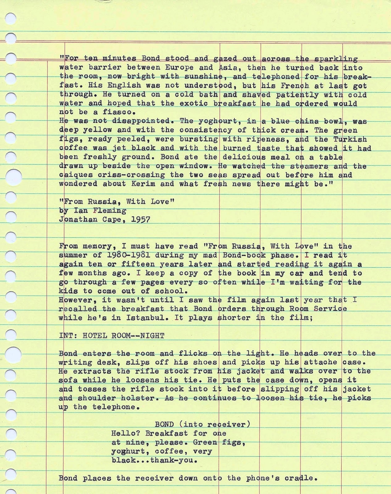
And I had an Omega Speedmaster Professional. A lot like the one worn by the Apollo 11 astronauts when they landed on the Moon in 1969.

So, I set up the shot, put on the watch and shirt, and handed the digital camera to my son.


Now, I never shipped out on the Skate, Shark or Nautilus. Nope. But I did do 22 years in the hospitality industry, much of that behind a coffee machine. So the group handle would be my version of the periscope handle.
I spent ages trying to match the angle of my girly hand to that of the Submarine captain's. I may have had slightly (and I DO mean slightly) better luck with the sneer as I curled the left side of my mouth a little. I can look world-weary too, you know.

A bit of fidlling around on Photobucket to copy the layout of the Rolex advert and I was done.

In the end, he wound up buying the Rolex. But he still wants a Speedmaster.

Of course, I had a bit of fun doing that ad, so it wasn't long before I started work on another.
On the watch forum, somebody will usually post up a picture on Friday of the watch they've worn that day. Other forum members will then chime in with pictures of their own watches and the thread will run for a day or two.
I was a regular contributor, but would often take a picture of my watch in a particular setting, rather than just clamped around my wrist. After selling watches for twelve years, I've seen enough wrists to last a lifetime.
So, I did another Rolex advertisement rip-off. Although with this one, I decided to make it more like the kind of ad that companies tend to do whereby they target a certain occupation. I spent longer than I should have on the copy.
And I used a different watch.


Then one day, I got to thinking about my recently purchased new smartphone, and how I didn't want to let it run my life. This one took me a while to align the writing and I wound up cropping it a little too close.


But naturally, sooner or later, technology would let me down. And, of course, I had to vent about it.


These next two were more to do with how I was feeling about my retail 'career'. It wasn't the customers that bugged me. They were fine, and I learned long ago how not to let the bad ones get to me. Nope, I was sick of the companies that I was working for. I worked for a high-end wristwatch boutique for just over ten years and I had had enough. So I quit (this is already documented here someplace) and went to work for a family-owned jewellery chain that was a ten minute drive from my house.


 It wasn't long before I realised that the new job was a real case of 'out of the frying pan, into the fire'. And the flames were beginning to tingle a little.
I had given serious thought to a career change and, after my Mother died last April, I figured it was the right time to start keeping busy and try some new challenges, like returning to study at this stage of my life.
Of course, it took a few more bad days at work to really convince me to hustle my butt out of there.


This next one was at the end of a week where my children's days at school were leaving a lot to be desired. I wrote a letter to the school principal regarding the bullying situation and got a reply made up of teacher-speak regarding 'strategies in place' and 'we take these instances seriously' and 'all staff are made aware of the situation', etc, etc.  But whatever 'strategies' they had 'in place', they weren't working. 


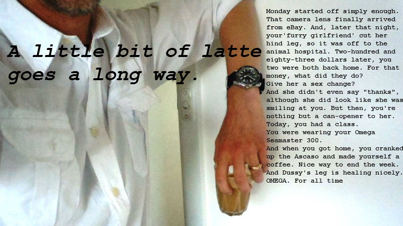
Her Ladyship (the cat) managed to somehow cut her hind leg on something, so it was off to the vet. Sometimes, a cup of coffee makes everything better.


And that's it. Life has been a little hectic in recent months and I have channelled my energies into other things, but I'm sure there will be instances that occur which will inspire me to put together more of these ads.
Actually, I think I got an idea for another one, but it's just hit 9:01pm and I need daylight to take the kind of photo that I'd like for it.
I'll get onto it soonish.

Thanks for reading!


Monday 11 March 2013

Breakfast, Bond Style


Freeze-frame taken from "From Russia With Love" (Dir: Terence Young, 1963) Picture courtesy of DANJAC/EON Productions.


Thanks for reading, all!


***typecast on a circa 1951 Olympia SM2***

Saturday 2 March 2013

Trying My Hand At Vintage 1st Edition Bond Book Cover Art...With Mixed Results.

 EDIT: My apologies, folks. This is a post from a couple of months ago. I made a slight correction to some spelling and hit the 'update' button instead of 'close', so it's basically been accidentally re-posted. Ah, well...


EDIT- I mentioned above that these were watercolours. Further research tells me that Richard Chopping painted more in the trompe-loeil style, which gave his illustrations an almost 3 dimensional quality.
************************************

While the first four Ian Fleming novels ("Casino Royale", "Live And Let Die", "Moonraker" and "Diamonds Are Forever") were released with nice cover designs, it wasn't until 1957's first printing of "From Russia, With Love" that Richard Chopping's artwork was first used. If I ever see one of these in good condition and I have the bucks (unlikely), I will swoop on it.


The copy of "Octopussy & The Living Daylights" is a 1966 First Edition.


Whereas this copy of "Goldfinger" is a 1974 reprint, but the artwork is a reproduction of the original from 1959.


Richard Chopping was commissioned to do the covers for most of the Bond novels.


In the late 1970s, Glidrose Publications (I've also seen it spelled 'Gildrose', and these days, I don't know what the correct spelling is) decide to commission a new series of James Bond adventures and they approached John Gardner, a British thriller writer who was probably best known for his 'Liquidator' series of spy novels from the Sixties. These books were considered the opposite of James Bond's adventures. Delivered in a blackly comic tone, these books featured an inept secret agent named 'Boysie' Oakes who had a fear of flying and abhorred violence. At the other end of the spectrum was John Le Carre, who had written the gritty, down-beat and realistic spy novel, "The Spy Who Came In From The Cold" in 1963. Gardner later wrote a series of more realistic spy stories featuring a man named Herbie Kruger before writing three novels featuring Sherlock Holmes' arch-nemesis, Professor Moriarty.
 
So anyway, Gardner completed his first James Bond continuation novel in 1981. It was titled "Licence Renewed" and featured an older James Bond, transported to the Eighties, smoking less, driving a SAAB(!), and a little more tolerable of feminism.
Glidrose Publications went the extra mile by getting Richard Chopping to provide the cover artwork for this book. And it was as good as anything he'd done for the Fleming novels.
 
 
The (almost a) trademark fly was back in evidence. Similar artwork was used for the next four Bond novels that Gardner wrote, but the work was done by another artist in similar style.


"For Special Services", 1982- jacket painting by Bill Botten


                                                                                 "Icebreaker", 1983- jacket painting by Bill Botten 


"Role Of Honour", 1984- jacket painting by Trevor Scobie


                                       "Nobody Lives Forever", 1986- jacket painting by Trevor Scobie


And then, for Gardner's fifth book, the paintings of this style were ditched in favour of this kind of illustration.


          "No Deals Mr. Bond", 1987- jacket painting by Trevor Scobie


Don't ask me why. I much preferred the atmospheric paintings, although I do recall a lot of spy novels and airport thrillers of the time employing similar kinds of artworks for this kind of book. It was probably a cheaper option, no doubt.
Yeah, I'm cynical.
 
 
Out of desperation, I took a photo of the top of the dining table;
 
 
And for about 42 seconds, I actually thought I could print this out on a sheet of A4 paper and it might just work. But there was something about it that just didn't seem right.
And so the hunt continued.


Not quite the look that I was going for. And it would smudge to the touch.
 
 
This clearly wasn't going to last throughout all of 2013.


After much minor adjustment and lining it up as perfectly as I could, I finally pressed down on the adhesive plastic. And here was the final result.


I wanted to put more on the cover besides just the year and the fact that this was a diary. And so, I printed out the only thing I could think of. And it also gave the whole thing that Robert Ludlumesque touch, which was why I called this blog what I did.
And I took my time with this part of it because I wanted to ensure that the title lined up along the spine properly. It could have been a little higher along the spine, but otherwise, it came up alright.


Now, the real test will be to see if I can actually write important appointments, To Do Lists, phone numbers, and other useful stuff in this thing next year. This diary uses 65% recycled paper, which means that it won't be too fountain pen-friendly, but I should be okay if I use a medium nibbed pen as well as a Fisher ballpoint...and maybe some pencils here and there.
Although, I think for 2014's diary, I may have a shot at printing out that photo of the dining table top. What have I got to lose?
 
And that's my Bond Hardcovers blog post taken care of. When I get my Bond paperbacks out of storage, I think I'll do a write-up on those. And I should do one on my Ludlum thrillers that were printed in the Eighties. Very bold cover art on them.
 
Thanks for reading!